
Designer QR codes: how far can you go before it stops scanning?
Brands love QR codes and hate how they look. A square of black noise in the corner of a carefully designed pack, a poster or a greeting card feels like a barcode stuck on a painting. So the question comes up in almost every packaging or print project we work on: can the code look like us, and still open the page?
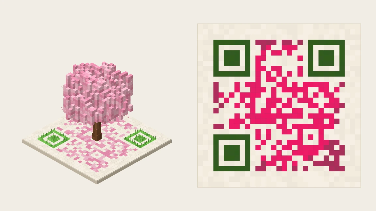
It can, further than most people think. A phone camera does not need a black-and-white grid; it needs a handful of landmarks and enough contrast between “dark” and “light” squares. Everything else is room to design. To show how much room, Pierre at ARGO built QR Orchard: a small voxel world grown on top of a QR code. Seen from the side, it is a tree, a city or an island. Seen from above, it is a code your phone will read.
Try it: a scene that folds into a code
QR Orchard: a scene that folds into a QR code
Voxel scenes that fold into your code
Checking scan…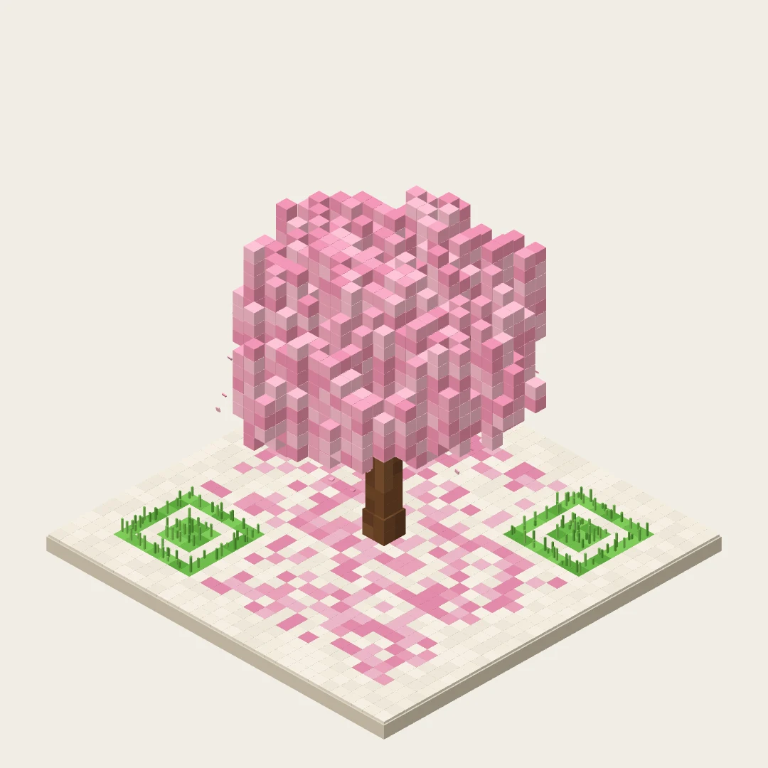
An interactive voxel scene built on a QR code: every voxel stands on a dark module of the code. Tapping the scene swings the view from an isometric angle to straight above, where the scene becomes a QR code that opens the link typed below. You can change the link, the object, the season and the colours; a chip says whether the result still scans.
Tap the scene to fold it into its code, then point your phone at the screen. Type your own link, change the object, the season or the colours, and watch the chip: it decodes the top view with the same kind of reader a phone uses. Exports give you the animation, the code and the scene in high resolution.
The trick is simple: every voxel stands on a dark square of the code. The leaves of the tree, the towers of the city, the rocks of the island all sit on dark modules, so from straight above their footprint is the pattern. Supports that would fall on light squares, the trunk, the mushroom’s stem, the balloon’s ropes, sink into the ground as the view folds. And the colours darken on the way down, from a soft palette to a deep ink, because a scanner needs dark modules, not pretty ones.
What a phone actually looks for
The QR code was released in 1994 by Denso Wave, then a division of Denso, and the car industry was the first to adopt it, for its production and shipping labels. Thirty years later, readers still look for the same things.
The three finder patterns. The big squares in three corners tell the camera where the code is, how it is rotated and how big it is. They are the part a reader needs to find first, which is why QR Orchard leaves them flat and only grows grass on them.
The modules. The code is a grid of small squares, from 21 × 21 for the smallest version to 177 × 177 for the largest; each version adds four modules per side. The more you encode, the more modules you get, and at the same printed size, the smaller each one becomes.
The quiet zone. A blank margin around the code separates it from everything else on the page. The standard asks for four modules on every side. It is the rule designers break most often, by running a code right up to a frame or a photo.
Error correction. Part of every QR code is redundant data, a Reed-Solomon code that lets a reader rebuild what is dirty, damaged or covered. There are four levels: L restores about 7% of the data, M about 15%, Q about 25% and H about 30%. Level M is the one most often used; QR Orchard uses it too.
How far you can go
Colours: yes, with contrast. The modules do not have to be black. What matters is that the dark ones read clearly darker than the light ones. QR Orchard pushes every colour of the scene towards a deep ink of the same hue when it folds into the code, and its chip turns red when a palette gets too pale. A safe default: dark modules on a light ground, never the reverse. Some apps read inverted codes, light on dark, and some do not.
Shapes: yes, within each module. Rounded dots, small hearts or voxels can replace squares, as long as each one stays inside its module and keeps enough of it dark or light. Merging neighbours into a continuous drawing is where readability starts to suffer.
A logo in the middle: yes, within the error budget. A logo covers modules, and error correction rebuilds them. A logo over a small part of the code can work at level H, where the same logo would break a level-L code. Keep it in the centre and never on a finder pattern.
Size: it depends on the module, not the code. What a camera has to resolve is one module. Denso Wave’s own example: with modules of 0.254 mm, a version-3 code of 29 modules is about 7.4 mm wide, before its quiet zone. A long URL means more modules and a bigger code for the same readability; a short link keeps the code small and lets you change its destination after printing.
QR Orchard bends one rule on purpose: its margin is three modules wide, one less than the standard asks. Its scan check shows it still reads on screen. In print, give your code the full four.
Test it like a scanner, not like a designer
A code that scans on your own phone, on screen, proves very little. Before a pack or a poster goes to print, test the real artwork: printed at the real size, on the real material, under shop lighting, with several phones and the default camera app, from the distance people will actually stand at. Check the quiet zone survived the layout, the finder patterns are untouched, and the contrast holds on glossy or metallic finishes. QR Orchard automates the first step, a decode of the top view after every change, but nothing replaces a phone in front of the printed proof.
At ARGO
QR codes are the door to most of what we build: augmented reality on packaging that opens in the browser with no app, video stickers that play a personal message, greeting cards that come alive. We design those codes to belong to the artwork, and we route them through short links so their destination can change and every scan is counted. If you want a code that looks like your brand and still opens on every phone, let’s talk.
FAQ